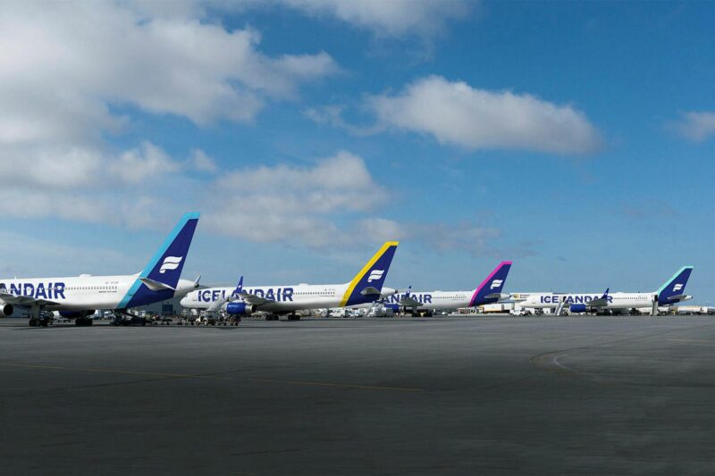
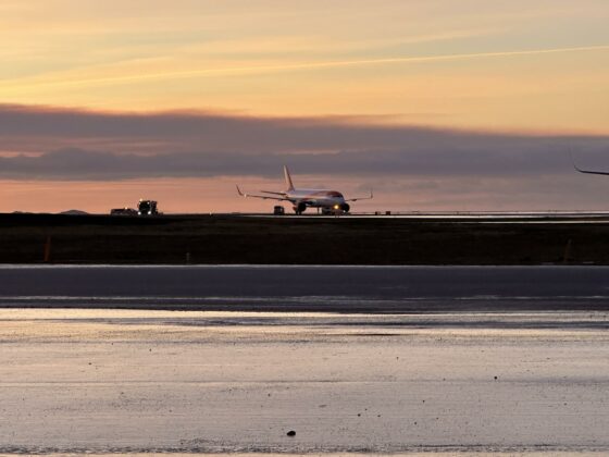
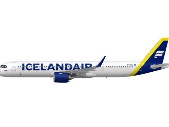
At the beginning of next year, the appearance of Icelandair’s aircraft fleet will begin to change greatly from what people are now used to, Vísir posted with the reference to airline’s director of marketing Gísli S. Brynjólfsson.
The golden colour that has dominated all the company’s marketing materials, along with blue and white since 2006, will now disappear and instead, more emphasis will be placed on a fairly diverse colours that Gísli says is drawn from Icelandic nature, not least the colourful northern lights. . “We believe that this approach underlines the diversity that Iceland and Icelandic society stand for. We also did an analysis of where airlines are located on the colour chart and most are either red or blue. The low-cost companies are more common in red than the others in blue. By using more colours, we enable ourselves to stand out from the crowd and attract the attention we deserve”, said Gísli S. Brynjólfsson.
He points out that there will be a new logo, which is white on a blue background, and behind the logo will be a colour stripe that will vary on different planes: “We aim to use about six colours and this will be fun, not least because many planes come together. We also envisage connecting passengers paying attention to this when they switch from, for example, a pink plane to a green one.”

